The “CStudioco” logo features a dynamic blend of colors and unique design elements that together convey the agency’s creative ethos and adaptability. The logo uses a vibrant coral (FF665E), a serene periwinkle (7175E2), a soft off-white (FAF0E6), and a classic gray (4D4D4D) to create a visual representation that is both inviting and professional. The coral provides a burst of energy, periwinkle adds a touch of creativity, off-white offers a clean background, and gray grounds the design with a tone of seriousness.
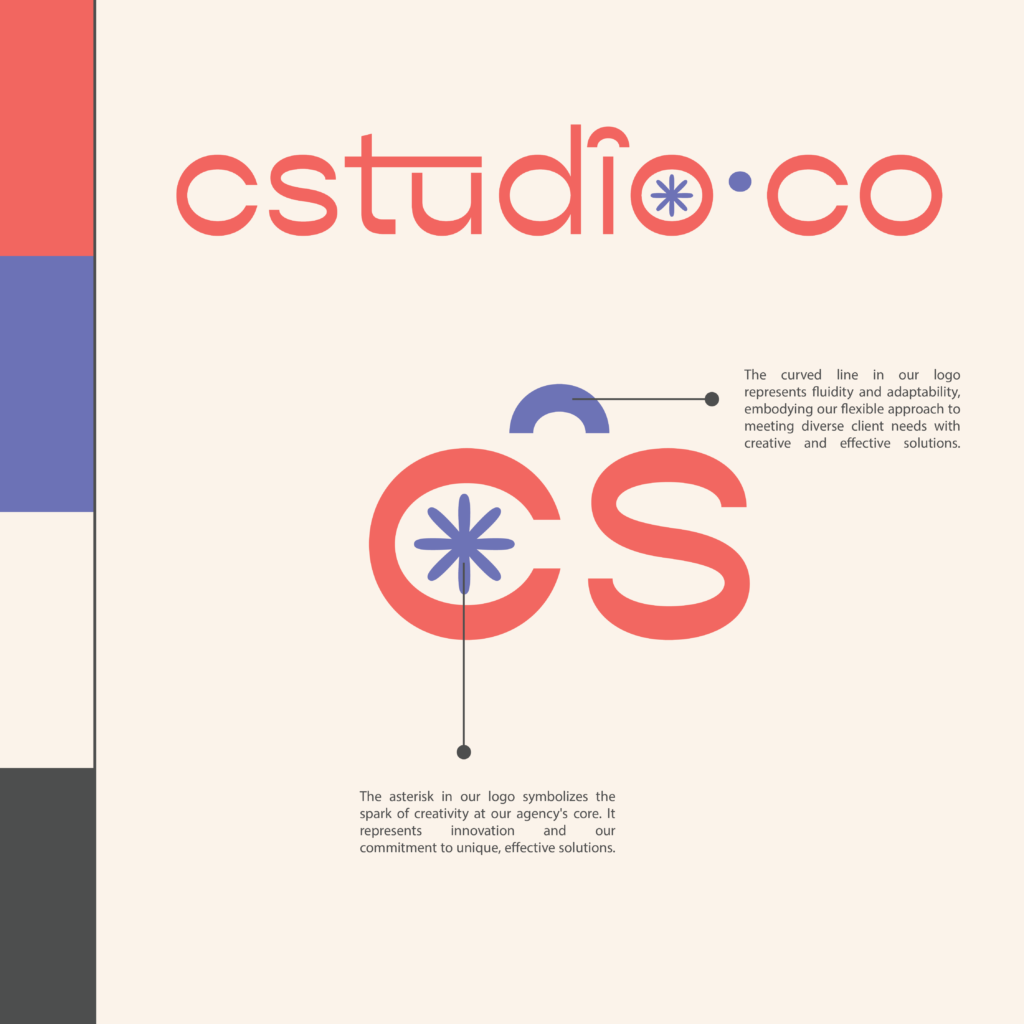
The use of a curved line atop the letter “i” replaces the traditional dot, emphasizing fluidity and the continuous flow of innovative ideas. This design choice, coupled with the placement of an asterisk within the “o”, symbolizes a spark of inspiration central to CStudioco’s approach. Together, these elements and colors encapsulate the agency’s commitment to delivering flexible and imaginative solutions to their clients.
Explore More Designs

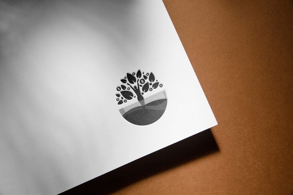
The Black Women’s Business Collective (BWBC) logo is a powerful representation of unity and growth. It features a black woman silhouette forming the trunk of a tree, symbolizing strength and resilience. Her raised hands serve as branches, reaching towards success and opportunity, while her roots extend deep into the ground, grounding her in her heritage and community.
Surrounding her are a collective of leaves, representing the diverse members of the BWBC community, coming together to form a flourishing tree of empowerment and prosperity. The inclusion of dollar signs among the leaves signifies economic empowerment and financial success, highlighting the collective aim of increasing economic opportunities for Black women entrepreneurs and professionals.